Mastering Box and Whisker Plots: Easy Comparisons Guide

If you've encountered data analysis or statistics, chances are you've come across box and whisker plots, commonly known as box plots. These simple yet powerful visualizations provide an overview of a dataset at a glance, showing its central tendency, dispersion, and outliers in one compact graphical summary. In this guide, we'll dive deep into mastering box and whisker plots, exploring how to interpret them, construct them, and use them for data comparison in a way that's easy to understand for both beginners and seasoned data analysts.
What Are Box and Whisker Plots?


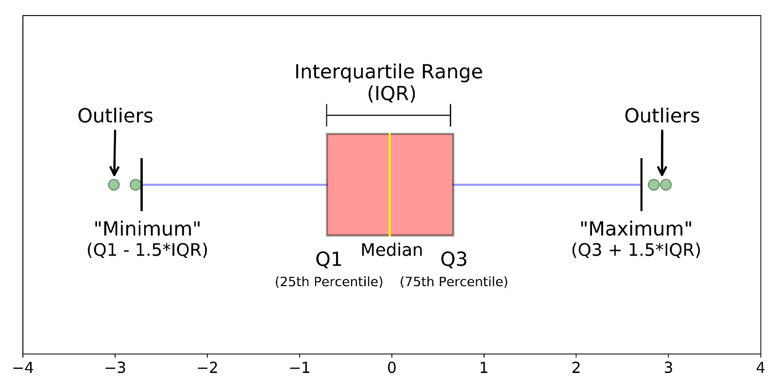
Box and whisker plots are graphical representations of datasets through their quartiles, displaying the median, the interquartile range (IQR), and potential outliers. Here’s how they’re structured:
- Box: Represents the interquartile range (IQR) from the first quartile (Q1) to the third quartile (Q3).
- Median Line: A line inside the box at the value of the second quartile (Q2), or the median.
- Whiskers: Extend from the box to show the range of the rest of the data, excluding outliers. Typically, the whiskers extend to 1.5 * IQR above Q3 and below Q1.
- Outliers: Data points outside the whiskers are marked as individual points or stars, indicating extreme values.
Constructing a Box and Whisker Plot

Creating a box plot involves the following steps:
- Calculate Quartiles: Determine Q1, Q2 (median), and Q3.
- Find the IQR: Subtract Q1 from Q3 to get the interquartile range.
- Draw the Box: From Q1 to Q3 with a line at the median.
- Plot the Whiskers: Typically extend to the minimum and maximum values within 1.5 * IQR from Q1 and Q3, respectively.
- Identify Outliers: Plot points for values outside the whisker range.
📝 Note: The method to calculate whiskers can vary depending on the software or statistical rules used, so it’s essential to clarify the methodology when interpreting or presenting box plots.
Interpreting Box Plots

Understanding what a box plot tells you about the data is crucial:
- Spread: The length of the box indicates the spread of the middle half of your data. A longer box suggests more variability.
- Skewness: If the median isn’t centered in the box or the whiskers are unequal, the data might be skewed.
- Symmetry: When the box plot is roughly symmetrical, the data distribution is likely symmetrical.
- Outliers: Points beyond the whiskers might indicate errors in data collection or true anomalies in the population being studied.
- Comparison: Box plots are excellent for comparing distributions across categories.
Using Box Plots for Data Comparison

Here are several ways to use box plots for effective data comparison:
- Distribution Comparison: Plot multiple box plots side by side to compare distributions. This can reveal shifts in central tendency, changes in variability, or differences in skewness across groups.
- Identifying Trends: Over time or across related categories, box plots can highlight trends, like growth or decline in data metrics.
- Spotting Differences: When comparing samples or groups, box plots make it easy to spot significant differences in medians or interquartile ranges.
- Outlier Analysis: Comparing outliers across categories can lead to insights into unusual behavior or events.
| Category | Median | IQR | Outliers |
|---|---|---|---|
| Group A | 25 | 15 | 5 |
| Group B | 35 | 10 | 2 |
| Group C | 20 | 20 | 7 |

📈 Note: Always interpret box plots alongside other statistics or visualizations for a comprehensive understanding of data.
In this journey through box and whisker plots, we've explored how to construct them, interpret their components, and utilize them for meaningful data comparison. Understanding these plots gives you a tool to quickly assess the distribution, skewness, variability, and outliers within datasets. Whether you're comparing exam scores from different classes, analyzing trends in sales data, or spotting anomalies in financial transactions, box plots offer a robust, visual way to get to the heart of your data. They simplify complex information into an accessible format, making them invaluable in any data analyst's toolkit. By leveraging box plots alongside other statistical methods, you can gain a deeper insight into your data, making better, data-driven decisions. This guide equips you with the knowledge to harness the power of box and whisker plots, enhancing your data analysis capabilities.
What if my dataset has no outliers?

+
Without outliers, your whiskers will extend to the minimum and maximum values of your data, providing a clear view of the entire range of your dataset.
Can box plots be used for skewed distributions?

+
Yes, box plots can effectively visualize skewed data. The position of the median in relation to the box and whiskers will help identify the direction and extent of skewness.
How do I choose between a box plot and a histogram?

+
Box plots are ideal for showing summary statistics and comparing distributions, while histograms provide a detailed look at the frequency distribution. Choose based on what aspect of the data you want to emphasize.
What software tools can I use to create box plots?

+
Many statistical software tools like R, Python with libraries like Matplotlib or Seaborn, SPSS, Excel, and others support the creation of box and whisker plots.
How do I handle large datasets in a box plot?

+
For large datasets, consider using a notched box plot for median comparisons or overlaying box plots with violin plots to get an idea of the data distribution’s density.


