How to Easily Add Clustered Column PivotChart in Excel

When it comes to data visualization in Excel, pivot tables and charts are unparalleled tools for quickly summarizing and analyzing large data sets. However, the magic truly happens when you combine these with charts, particularly through the use of a Clustered Column PivotChart. This powerful feature not only enhances data visualization but also makes your analysis more compelling and understandable to your audience. In this blog post, we will delve into the detailed steps on how to create and customize a Clustered Column PivotChart in Excel.
Understanding the Basics

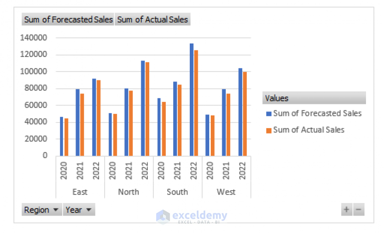
Before we get into the mechanics, it’s vital to understand what a Clustered Column PivotChart is. This chart type displays categorical data with vertical bars grouped by a secondary category, allowing for easy comparison across different categories or time periods.
Preparation of Data

Your data should be well-organized for effective use in a PivotChart:
- Ensure there are headers for each column.
- Remove blank rows or columns, as they can disrupt the pivot table layout.
- Check for any misaligned data or errors in the dataset.
Creating the PivotTable
First, we need to create the pivot table:
- Select your data range: Click anywhere within your dataset or manually select it.
- Navigate to Insert > PivotTable. Ensure your chosen data range is correct in the dialog box.
- Choose where you want the PivotTable report to be placed (new worksheet or existing one).
- Click OK. You’ll now see the PivotTable Fields pane.
Building the Clustered Column PivotChart
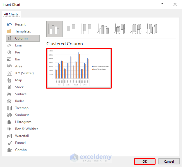
With your pivot table ready, here’s how you can add the chart:
- Select any cell within your pivot table: This ensures Excel knows which pivot table to associate the chart with.
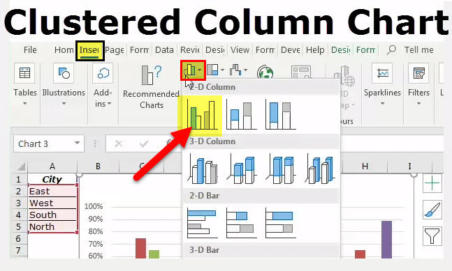
- Go to the Insert tab, and in the Charts group, choose PivotChart.
- From the Insert Chart dialog box, select Clustered Column under Column Charts.
- Click OK. Excel will automatically generate a basic chart based on your pivot table.
Customizing Your Chart

The real power of a Clustered Column PivotChart comes from customization:
- Choose Your Fields: Drag and drop fields into the Axis, Legend, and Values areas in the PivotTable Fields pane.
- Format Your Chart: Use the Chart Tools that appear when the chart is selected. Here, you can change colors, styles, axis labels, and more.
- Filter Data: Use the filter dropdowns on your pivot table or chart to focus on specific data points or categories.
- Change Chart Type: If needed, you can experiment with other chart types for comparison or when presenting data differently.
Here's a visual representation of some common customizations:
| Customization Option | How to Apply |
| Change Colors | Click on the chart, go to the Format tab, and choose from the options available. |
| Add Data Labels | Right-click on a series in the chart, select "Add Data Labels". |
| Adjust Axis Titles | Click on axis labels, then type or edit the titles directly. |
⚠️ Note: When altering the pivot table, remember that changes will directly affect the chart. Adjust the chart style or type if the new data layout is not compatible with the original chart format.
Your chart should now offer a compelling visual narrative of your data. Remember, the key to an effective PivotChart is not just the data it represents but how intuitively and effectively it communicates insights to your audience.
The final summary or analysis:
Adding a Clustered Column PivotChart in Excel is an excellent way to make your data analysis more intuitive and visually appealing. By following these steps, you can transform a complex dataset into an engaging, informative chart that helps stakeholders quickly grasp trends, comparisons, and patterns. This not only enhances the decision-making process but also facilitates better communication of your data insights.
What is the difference between a Clustered Column Chart and a Stacked Column Chart?
+
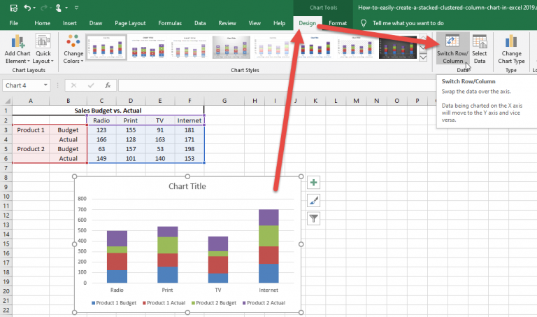
A Clustered Column Chart places columns next to each other for each data series, making it easier to compare individual categories across different series. In contrast, a Stacked Column Chart stacks one data series on top of another within the same column, focusing on the part-to-whole relationships.
How can I ensure my PivotChart updates automatically with changes in the underlying data?
+
Ensure that your source data range is dynamic or use an Excel Table as the source for your pivot table. Any changes or additions to the data within the table will automatically update your PivotChart.
Can I customize the appearance of each individual column in a PivotChart?
+
Yes, you can customize individual columns. Select the chart, right-click on the series or column you want to change, and modify properties like color, pattern, or border through the Format Data Series pane.