Create Box Plot On Excel

Introduction to Box Plots

Box plots, also known as box-and-whisker plots, are a type of graphical representation used to display the distribution of a set of data. They are particularly useful for comparing the distribution of different datasets or for identifying outliers in a dataset. In this article, we will explore how to create a box plot on Excel, a popular spreadsheet software.
Understanding Box Plot Components

Before we dive into creating a box plot, it’s essential to understand the components of a box plot. A box plot consists of the following elements: - Median (Q2): The middle value of the dataset when it is sorted in ascending order. - Quartiles (Q1 and Q3): Q1 is the median of the lower half of the dataset, and Q3 is the median of the upper half. - Interquartile Range (IQR): The difference between Q3 and Q1, which represents the range of the middle 50% of the data. - Lower and Upper Whiskers: These extend from the edges of the box to show the range of the data. The lower whisker represents the smallest data point that is not an outlier, and the upper whisker represents the largest data point that is not an outlier. - Outliers: Data points that fall outside the range of 1.5*IQR below Q1 or 1.5*IQR above Q3.
Creating a Box Plot in Excel

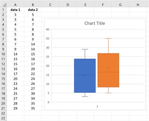
Excel provides an easy way to create box plots using the built-in Box and Whisker chart feature, which was introduced in Excel 2016. Here’s a step-by-step guide to create a box plot: - Select the data you want to use for the box plot. This should include the values you wish to analyze. - Go to the Insert tab in the ribbon. - Click on Insert Statistic Chart and then select Box and Whisker. - Excel will automatically create a box plot based on your selected data.
For versions of Excel older than 2016, you can create a box plot using a workaround that involves calculating the necessary statistics (median, quartiles, etc.) and then using these values to create a custom chart.
Customizing Your Box Plot

Once you’ve created your box plot, you can customize it to better suit your needs. Here are a few tips: - Change the Chart Title: Click on the chart title and type in your new title. - Modify Axis Labels: Right-click on the axis and select Format Axis to change the label or the scale. - Add Data Labels: You can add data labels to your box plot to display specific values, such as the median or quartiles.
Interpreting Box Plots

Interpreting a box plot involves understanding what each component tells you about the distribution of your data: - The position of the box plot on the number line tells you the central tendency of the data. - The length of the box represents the variability or spread of the middle 50% of the data. - Outliers indicate data points that are significantly different from the rest of the data.
Using Box Plots for Comparison

One of the most powerful uses of box plots is for comparing the distribution of different datasets. By placing multiple box plots side by side, you can: - Compare the median values of different groups. - Evaluate the spread of the data across different groups. - Identify outliers in each group.
📝 Note: When comparing box plots, it's essential to ensure that the scales are the same for all plots to avoid misleading comparisons.
Common Challenges and Solutions

Creating box plots in Excel can sometimes present challenges, especially in versions older than 2016. Here are a few common issues and their solutions: - Inconsistent Scales: Make sure all box plots are on the same scale when comparing them. - Difficulty with Outliers: Consider using a different method to display outliers or use a logarithmic scale if the data range is very large.
Advanced Box Plot Customization

For advanced users, Excel offers a range of options to customize box plots further, including changing colors, adding more data series, and modifying the chart layout. These customizations can make your box plots more informative and engaging.
To further enhance your box plots, consider the following: - Use Conditional Formatting: Highlight specific aspects of your data, such as outliers or the median. - Combine with Other Charts: Use box plots in conjunction with other chart types, like histograms or scatter plots, for a more comprehensive view of your data.
| Component | Description |
|---|---|
| Median | The middle value of the dataset. |
| Quartiles (Q1, Q3) | Q1 is the median of the lower half, and Q3 is the median of the upper half of the dataset. |
| Interquartile Range (IQR) | The difference between Q3 and Q1. |

In summary, box plots are a powerful tool for understanding and comparing datasets, and Excel provides a straightforward way to create them, especially in versions 2016 and later. By understanding the components of a box plot and how to customize them, you can gain deeper insights into your data and make more informed decisions.
What is the main purpose of a box plot?

+
The main purpose of a box plot is to display the distribution of a dataset, showing its central tendency, variability, and outliers.
How do I create a box plot in Excel 2016 or later?

+
To create a box plot in Excel 2016 or later, select your data, go to the Insert tab, click on Insert Statistic Chart, and then select Box and Whisker.
What does the interquartile range (IQR) represent in a box plot?

+
The interquartile range (IQR) represents the range of the middle 50% of the data, calculated as the difference between the third quartile (Q3) and the first quartile (Q1).


